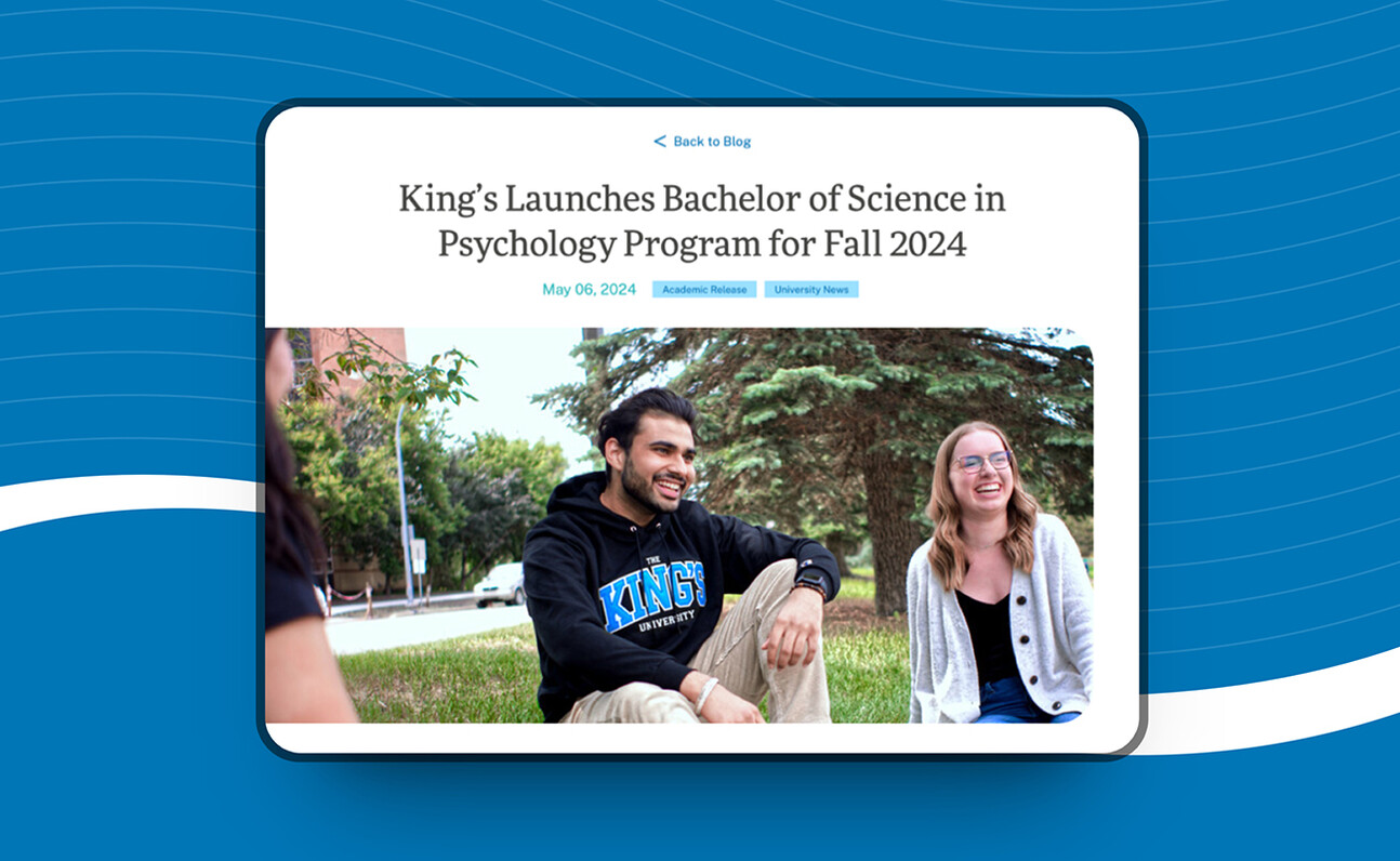
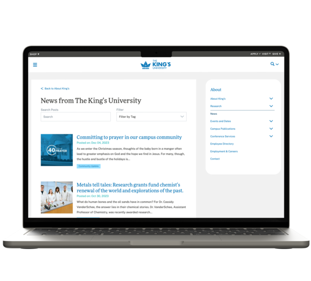
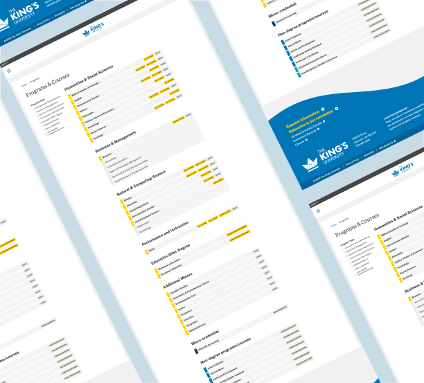
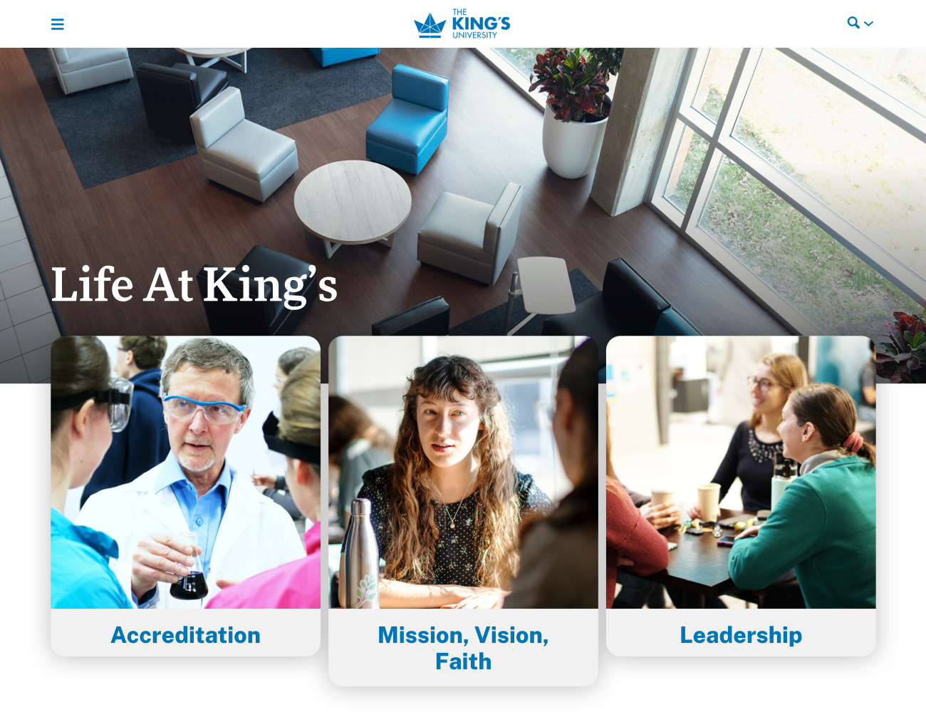
Our team tirelessly researched, planned, and conducted a variety of stakeholder focus groups to ensure that we were building a website that truly fit the needs of all faculties and ensured alignment with the University's five year plan. We developed new guidelines for King’s photography to ensure that branding was consistent and that the new website would have great, high-res imagery.
For the design of the website, we chose to move towards a clean and institutional look; ample use of white space, tasteful animations, and unique landing pages. Content and analytics research played a large role in the design - with each landing page being designed in a way which visually enhanced important pieces of information, we needed to make sure that the messages were concise and strategic.
There are some awesome functionalities in place for this website that make the site super easy to use for administrators and visitors alike. Features include:
- Integrated Staff and Department Directory: This allows all faculty to have bio pages that are searchable via the main directory and also pulled on to each respective Faculty page. Individuals in this directory can also be tagged to specific services so that their contact information is pulled to relevant pages (such as “Student Life”).
- Form Builder: Administrators can easily build forms and place them on pages throughout the site. For a site like King’s, with various departments, initiatives, and administrators, being able to add forms with all kinds of fields and contacts has become essential.
Over the years, we have become partners with the University and work very closely with the Marketing and Communications department for website enhancements
