Land Stewardship Centre

A fresh new website to showcase how the LSC engages in collaborations, Informs through community stewardship, and enables with tools and resources

Banner image for Land Stewardship Centre

What we did

Custom Website Design and Development

Awards won

2022 w3 Awards - Best in Show Winner;

The Land Stewardship Centre approached our team with the desire to create a new online experience that would excel at telling a clear story about who they are, where they came from,  and what they do. 

In close collaboration with the Land Stewardship our team has crafted a beautiful and dynamic new website with a focus of promoting how the Land Stewardship Centre:

Engages in collaborations
Informs through community stewardship
Enables with stewardship tools and resources

Secondary image for Land Stewardship Centre

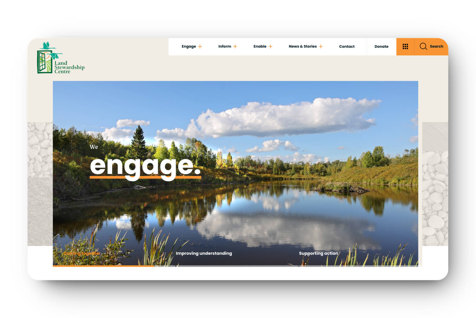
Custom graphics, textures based on natural themes, a welcoming and warm colour palette, have been combined with subtle animations, and strong imagery to maximum effect throughout the site.

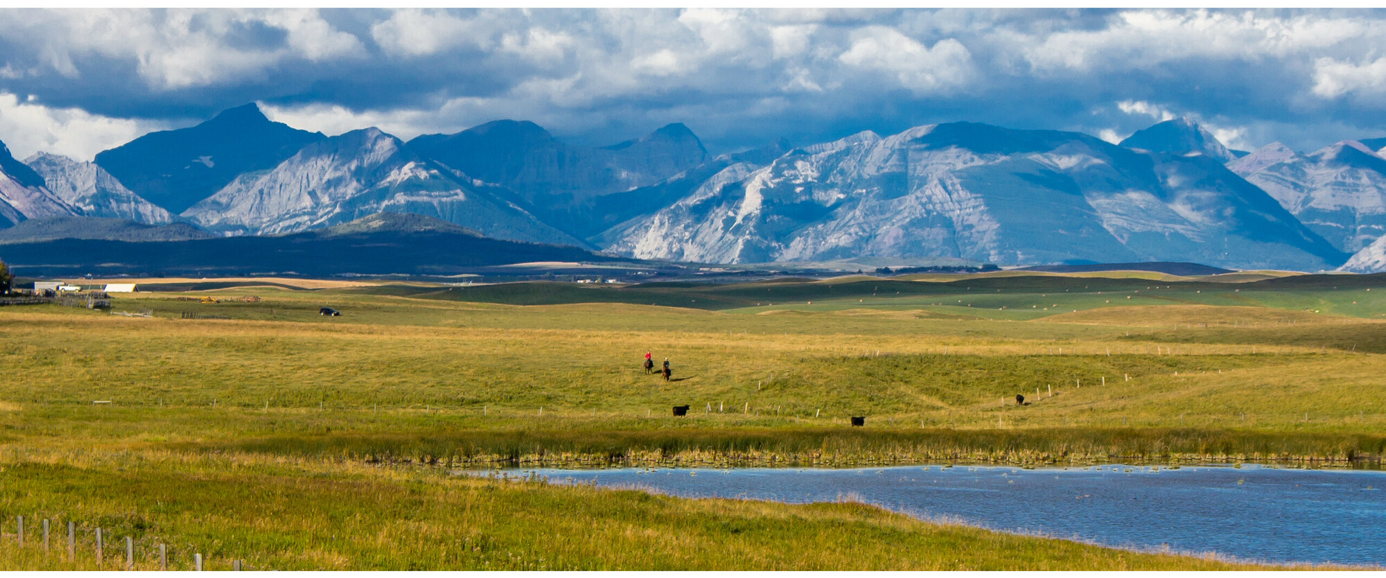
When visitors first arrive on the new Land Stewardship Centre website, they are greeted by a large rotating hero banner using a subtle zoom animation to create the feeling of the environment opening up before you, as if you’ve just walked out into the various Alberta landscapes being presented.

Visitors to the site feel an immediate feeling of engagement, enticing them to step further into the site and see the bigger picture that is Land Stewardship Centre. The site has also been made to be completely mobile friendly, collapsing beautifully into any screen size.
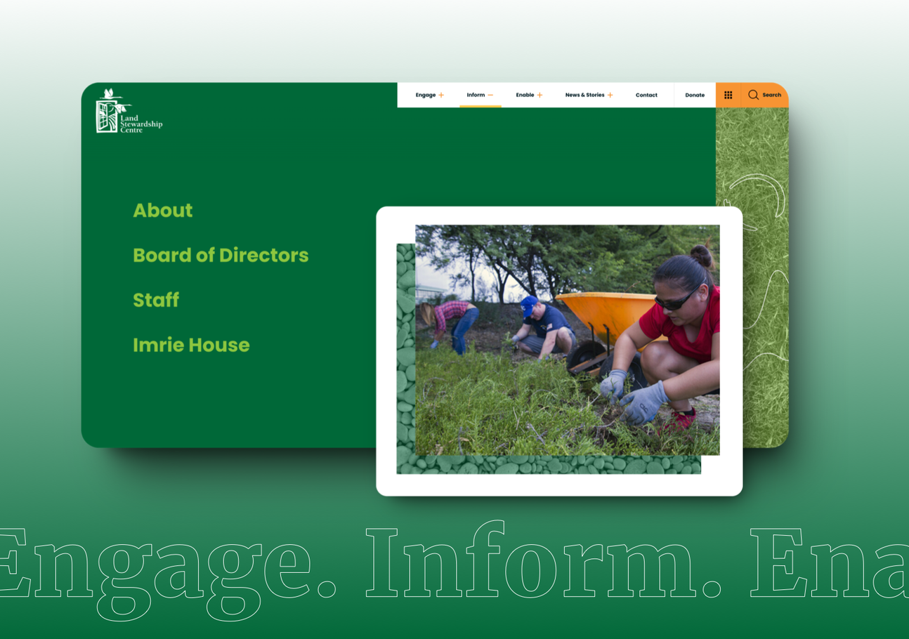
Images showing the Land Stewardship Centre project
top image for

Custom Timeline

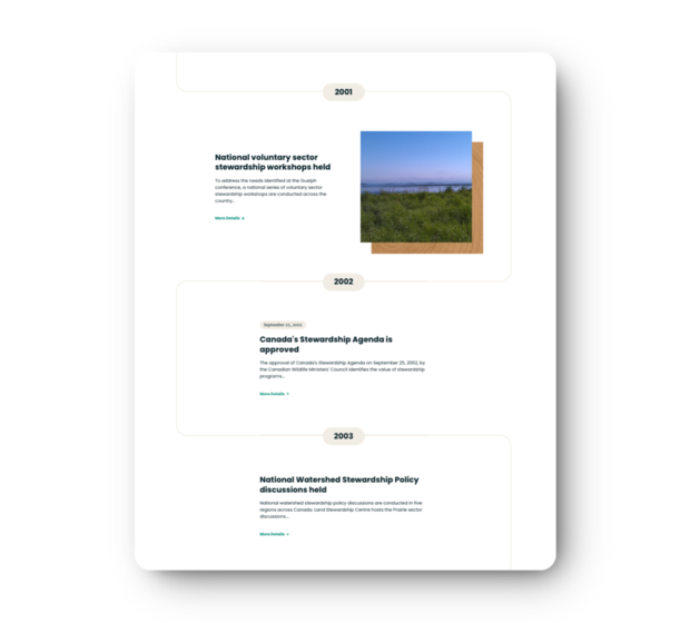
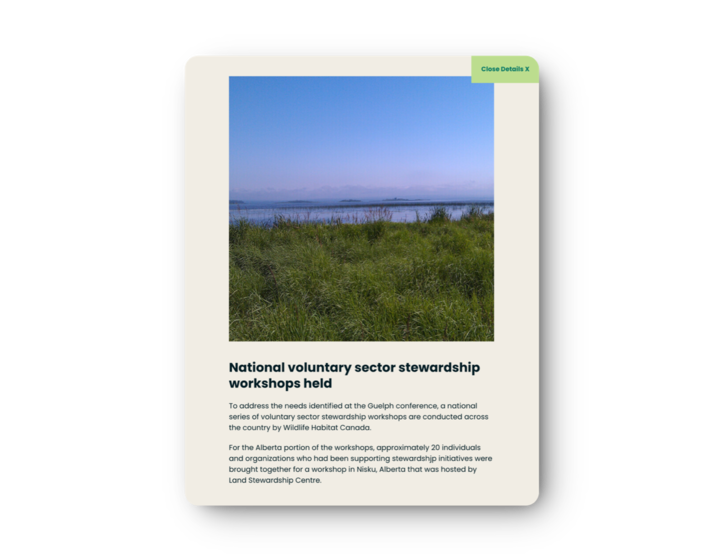
Our team created an interactive timeline to provide visitors with a unique way to step through each of the various entries in the history of stewardship connected with Land Stewardship Centre. Each section on the timeline is created with a custom combination of imagery, natural textures, colour choice, and hand drawn graphics. Each entry can be expanded to show in a styled slide-out panel element complete with an optionally defined call to action button.
bottom image for
 

This is the third website I’ve worked on with Box Clever in the past two years. All have been incredible but the new Land Stewardship Centre website is something that stands above. I am captivated by the site and grateful to have had the opportunity to collaborate with the incredibly talented Box Clever team to bring it to life.

Kristina Dembinski

Communications

0+

Tools & Resources

0+

Core Programs

0+

Partnerships

Highlight image for Tools & Resources

Tools & Resources

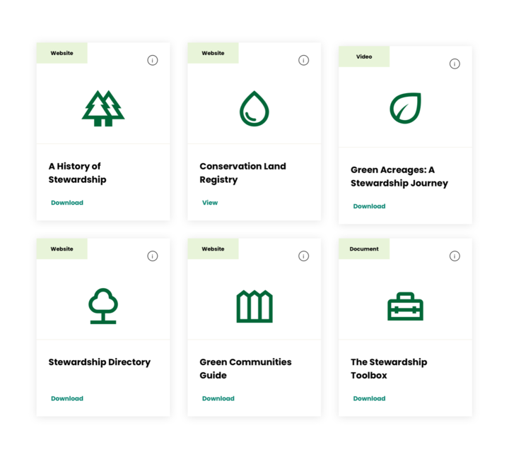
Of equal importance to the new site was having a robust Stewardship Tools and Resource area. An easy to browse solution, with custom image tiled display was created as a way to promote the various tools and resources such as the programs offered by, through, or in partnership Land Stewardship Centre.  

Website resources such as the Green Communities Guide provide a link out to the service, where others like the Green Acreages Guide Primer, provides a direct file download.

A small interactive info icon provides further expands information about the specific tool or resource alongside the appropriate view or download call to action.

Highlight image for Programs

Programs

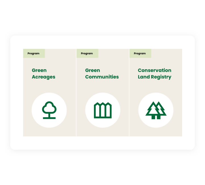
In addition to their library of tools and resources, our team provided designs for custom program cards allowing the LSC team to have homepage highlights of their primary Program offerings and enabling them to promote access to a high quality set of both stewardship tools, resources, and programs on the new website.