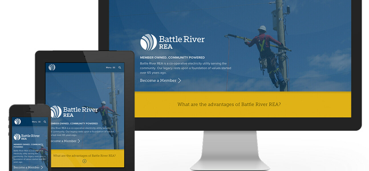
Google is about to launch another update and this time it is a big one. No really we mean it, it’s big. Many Google updates pass the common website owner by without too much notice, however this update is one that will drastically affect a large percentage of all Google searches that are performed and therefor affect every website’s searchability and rank with Google.
Though never before considered, Google will now use mobile-friendliness as a ranking factor in its algorithm. What does that mean to all website owners? If your website is not currently mobile friendly, your search ranking could suffer.
What does it meant to be mobile friendly?
Any website that requires you to zoom, pinch, swipe side-to-side and attempt to click on links that are impossible to hit on because they are so tiny are all red-flags showing that your site is not optimized for mobile usage. Using a site like this results in poor user experience so Google has decided to reward sites that provide a mobile platform making the site as easy to use on a mobile device as it is on any desktop.
The new algorithm will allow Google to serve up the sites that are simple to read, that offer navigation buttons and links that are easy to tap, and that have images that are sized specifically for mobile viewing.
The current Google search results do offer a “Mobile-friendly” label on them, however when the new algorithm goes into effect on April 21st, sites that are mobile-friendly will be rewarded and those who aren’t will be penalized.
Since it is Google who is making this algorithm change, they have also kindly created a tool you can use to see if your site is mobile-friendly or not. Click here to see how your site makes out.
A green banner will let you know if your website has passed.
If your site does not pass, Google will point out what errors it detected including text to small, links too close together, and the content is wider than the screen. The final error may say that the mobile viewpoint is not set. The mobile viewpoint of a website controls the width of the page for the device it is being displayed on. With a proper responsive design your site will automatically adjust itself for the device it is being viewed on, without responsive settings built in your site will not pass this test.
The tool will also offer you will also offer buttons for what to do next if you built the site yourself, had someone build it or used a generic CMS. No matter what your answer is to these options, Box Clever is here to solve your optimization problems.
Does your site need to be mobile-optimized?
Contact Box Clever at today to see how we can help get your site ready for the big change: call 780-485-1230, contact us via email, or tweet us @boxclever.
