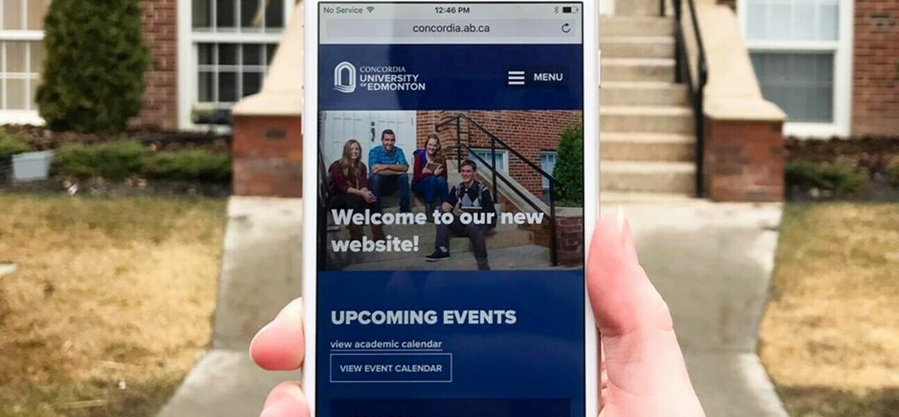
In 2015 Concordia University of Edmonton made the step in becoming a fully accredited University.
With their recent status change in mind, Concordia knew two things: the brand had to be refreshed and the website was in definite need of a facelift and a technical overhaul.
We worked collaboratively with local marketing agency, Zag Creative, on this project who did an awesome job of both the brand refresh and the major advertising campaign that followed. Way to go guys!
As far as this post-secondary website was concerned, our goals were centred around improving accessibility and experience. The digital portion of this project unfolded in two phases. The first phase focused on making minor enhancements throughout the site like a snazzy new programs landing page, and an updated header and footer. The second phase was focused on the technical side of things. The old website was built using a Multisite WordPress install and as a result was quite fragmented; managing content was a headache for administrators and inconsistent front-end design made for a poor user experience. Gone are those troublesome days! The new site is now a single WordPress site with a number of custom plug-ins.
Arguably the biggest improvement to the website is that it is now fully responsive! A pivotal change as approximately 30% of site visitors in 2016 were accessing the site on their mobile devices.
The fresh new website launched successfully before the end of the winter semester - congratulations Concordia!
