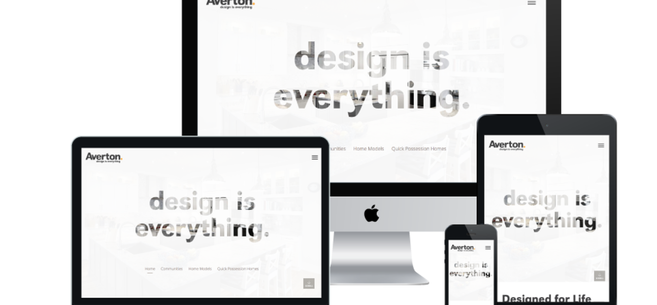
We are more than excited to announce the launch of the new Averton Homes website!
With our shortest timeframe yet, the team at Box Clever spent numerous hours collaborating over strategy, design, and development; and the result is a website as beautiful as the homes it showcases!
Throughout the site, we made sure to keep all elements consistent and true to the Averton brand along with the use of large, beautiful typeface for increased legibility. A branded landing page has also been designed for each community, which conforms to its own style guide and acts as a stand-alone site.
It was of utmost importance to improve user experience on the Averton website. The most important sections on the site, Home, Communities, Home Models, and Quick Possessions, are easily accessed by a homepage menu. Users can also navigate to different provinces when they first land on the website or by accessing the province toggle provided for simple navigation to all important areas of the site.
The team at Box Clever custom built the Homes Module for Averton Homes in order to present information that the typical home buyer is looking for, such as the number of bedrooms, floorpans, and even photos! Though this information is displayed on multiple pages throughout the site, it only has to be entered once. Easy to update and easy to navigate, what could be better?
All pages were created using responsive scalability, which is essential to providing the best user experience across any device. Site visitors have full functionality of the site with no need to pinch and zoom, even if they are on their mobile phone standing in front of one of the beautiful Averton show homes. We also integrated Averton’s social media platforms to encourage users to interact with the company online.
After countless dedicated hours, we are proud to share our hard work and reveal the beautiful and functional new site design for Averton Homes! Be sure to check it out on any device!
